Rise by Six: Your Daily Dose of Inspiration
Explore insights and stories that elevate your day.
Choosing Fonts like a Design Ninja
Master the art of font selection and elevate your designs! Discover tips and tricks to choose fonts like a design ninja.
Mastering Typography: The Essential Guide to Choosing the Perfect Font
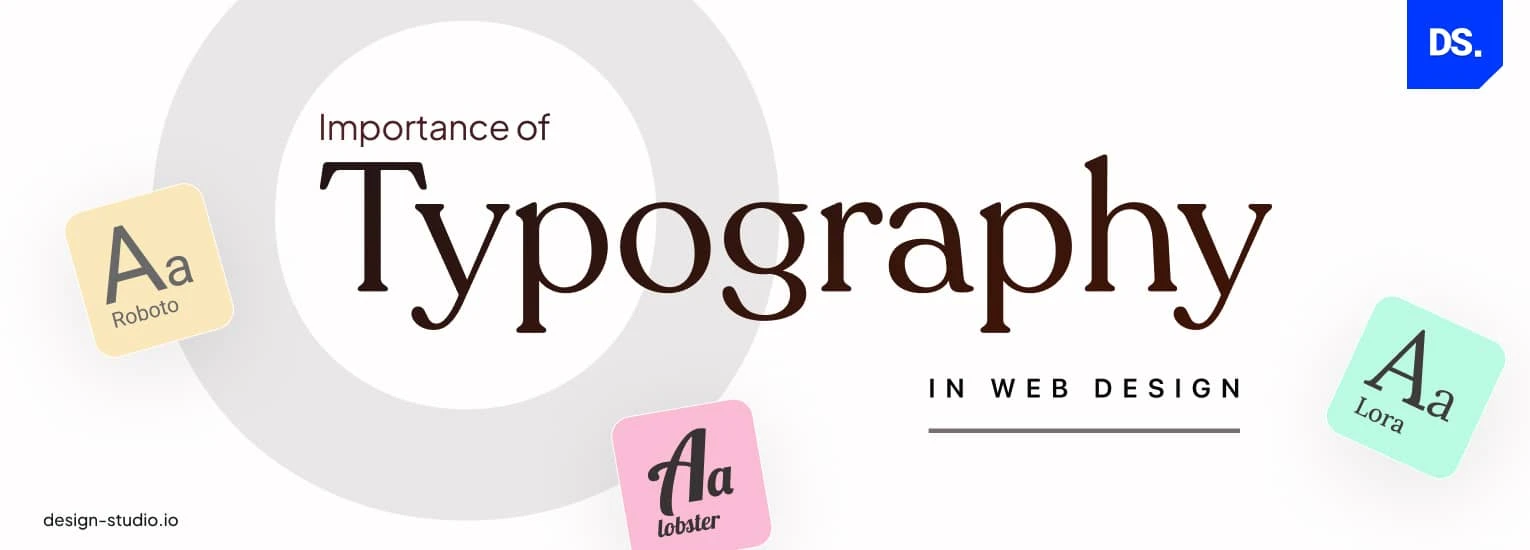
Mastering Typography is a crucial skill for anyone who wants to create visually appealing content. When it comes to choosing the perfect font, consider the mood and tone you wish to convey. For example, serif fonts like Times New Roman exude tradition and formality, making them ideal for print materials and professional documents. In contrast, sans-serif fonts such as Arial or Helvetica offer a modern and clean appearance that works well for digital platforms. When selecting a font, keep in mind that readability is key; it's essential to ensure that your font choice is not only attractive but also legible across all devices.
Another vital aspect of typography is maintaining a harmonious font pairing. Ideally, your header font should complement your body text. A good rule of thumb is to choose one font for headlines and another for body copy. Consider creating a list of compatible fonts that you can use:
- Header Font: Playfair Display
- Body Font: Lato

Common Pitfalls in Font Selection and How to Avoid Them
Choosing the right font for your design can greatly influence the readability and overall aesthetic of your content. However, common pitfalls in font selection often lead to designs that fall flat. One frequent mistake is using too many fonts in a single project. This can create visual chaos and distract the reader. To avoid this, stick to a maximum of two or three complementary fonts—one for headings, one for body text, and an optional accent font. Additionally, ensure that your chosen fonts align with the intended tone of your content; a whimsical font may not be suitable for a professional report.
Another common issue arises from neglecting to consider font legibility, especially at smaller sizes or on various screens. It's easy to get carried away by decorative fonts, but if your audience struggles to read the text, the message will be lost. Always test your chosen fonts in different contexts and sizes. It's advisable to use web-safe fonts or those that are easily accessible across various devices and browsers. By prioritizing readability and consistency, you can enhance user experience while steering clear of the pitfalls related to poor font selection.
How to Match Fonts with Your Brand's Personality: A Step-by-Step Approach
Choosing the right fonts for your brand is crucial as they can effectively communicate your brand's personality. Start by defining your brand's core values and personality traits. Is your brand fun and playful, or more serious and professional? Consider conducting a brand personality assessment to clarify these traits. Once you have this clear, begin exploring various font styles that align with your identified attributes.
Next, create a short list of potential fonts and test them in various contexts. For example, consider how the font looks on your website, social media posts, and marketing materials. You might find that serif fonts convey tradition and reliability, while sans-serif fonts feel modern and clean. Remember to pair fonts wisely; combining a bold heading font with a simple body font can enhance readability while reflecting your brand's style. Keep it consistent to establish a strong visual identity.