Rise by Six: Your Daily Dose of Inspiration
Explore insights and stories that elevate your day.
Color Your World: Transforming Websites with the Right Hues
Unlock the power of color! Discover how the right hues can transform your website and captivate your audience.
The Psychology of Color: How Hues Affect User Experience on Your Website
Color is not just a visual element; it plays a crucial role in shaping our emotions and perceptions. The Psychology of Color delves into how different hues can significantly affect user experience on your website. For instance, blue is commonly associated with trust and reliability, making it an ideal choice for financial institutions. In contrast, red evokes a sense of urgency and excitement, often used in clearance sales or events. Understanding these associations allows web designers to strategically use color to enhance user engagement and drive desired actions.
To effectively leverage the psychology of color, consider how your target audience will interpret various colors. For example, a website aimed at children might use vibrant, playful colors like yellow and orange to create a fun atmosphere. In contrast, a site focused on luxury products might favor black and gold for a more sophisticated look. By aligning your color choices with your brand identity and user expectations, you can create a more intuitive and enjoyable user experience, ultimately leading to higher conversion rates.

Choosing the Right Color Palette: Tips for a Visually Stunning Website
Choosing the right color palette is crucial for creating a visually stunning website that captures your audience's attention. A well-considered color scheme not only enhances the aesthetic appeal of your site but also conveys your brand's message and values. To start, consider your target audience and the emotions you want to evoke. For example, blue often represents trust and professionalism, while red can evoke excitement and urgency. It's also important to choose a primary color that reflects your brand identity, and then select a few complementary colors to create balance and harmony throughout the site.
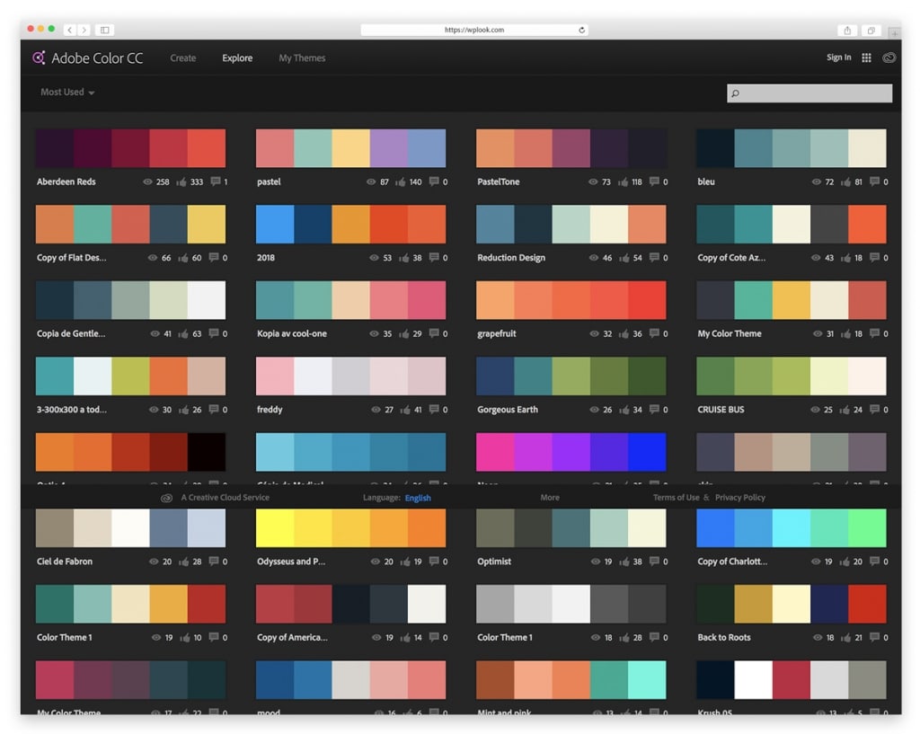
Once you've settled on a primary color, utilize tools like color wheel apps to find complementary or analogous colors that can enhance your palette. Building a cohesive color scheme can significantly elevate your website's design. A common approach is the 60-30-10 rule, which suggests using your primary color for about 60% of the design, a secondary color for 30%, and an accent color for the remaining 10%. This balance helps create a visually appealing layout that guides visitors' focus without overwhelming them. Testing your color choices through mockups or feedback can also provide insights into how your audience responds to your design.
What Colors Resonate with Your Brand? Unlocking the Power of Color in Web Design
Colors play a vital role in web design, significantly influencing how users perceive your brand. Understanding which colors resonate with your brand is essential for effective communication. For instance, blue often evokes trust and reliability, making it a popular choice for financial institutions, while green is associated with growth and tranquility, commonly utilized by eco-friendly companies. To make informed decisions about your color palette, it's important to consider your target audience, industry trends, and the emotional responses different colors can elicit.
When selecting colors, incorporate them into a consistent branding strategy that extends beyond just your website. Tools such as color wheels and palette generators can help you experiment with different combinations to find the perfect match. As you finalize your design, remember that accumulating visual elements that harmonize with your core message will create a more memorable and impactful user experience. Ultimately, unlocking the power of color in web design can help solidify your brand's identity and drive user engagement.