Rise by Six: Your Daily Dose of Inspiration
Explore insights and stories that elevate your day.
Typefaces That Turn Heads
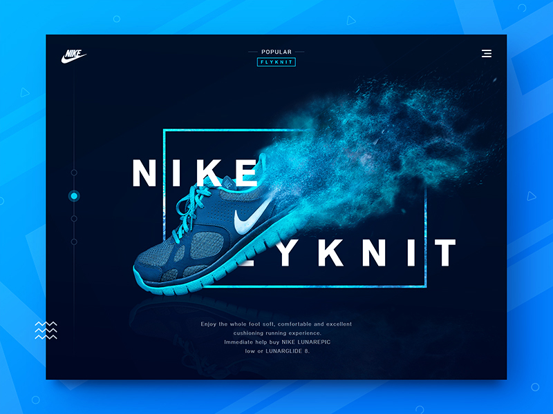
Discover stunning typefaces that demand attention! Transform your designs with fonts that captivate and inspire creativity.
The Art of Typography: How to Choose Typefaces That Turn Heads
The art of typography is more than just selecting fonts; it’s about understanding how typefaces influence the overall design and message of your content. When choosing typefaces that turn heads, consider aspects like readability, personality, and compatibility with your brand. A well-chosen font can evoke emotions and capture the essence of your message, whether it’s modern, classic, playful, or serious. Contrasting font styles can also create effective visual hierarchies, guiding readers' eyes through your content effortlessly.
To select the perfect typeface, start by defining your design goals. Think about your target audience and the impression you want to leave. Consider creating a typographic hierarchy by mixing serif and sans-serif fonts for headings and body text, ensuring both creativity and clarity. Additionally, limit your palette to a few complementary typefaces to maintain visual harmony. Remember, the right typography not only enhances aesthetics but also increases user engagement, making your content memorable and impactful.

10 Bold Typefaces That Make a Statement in Design
When it comes to making a statement in design, the right typeface can transform your message from ordinary to extraordinary. Bold typefaces not only capture attention but also communicate strength and confidence. Here are 10 bold typefaces that stand out in the crowded world of design:
- Impact
- Helvetica Bold
- Bebas Neue
- Futura Bold
- Avenir Next Heavy
- Montserrat Bold
- Oswald
- Anton
- Raleway Heavy
- Archivo Black
Each of these fonts brings its own unique flair, making them perfect for headlines, logos, and other design elements that need extra emphasis. Don’t underestimate the power of typography; selecting a bold typeface is essential for ensuring your designs leave a lasting impression.
Are You Using the Right Typeface? Discover Types That Captivate Your Audience
Choosing the right typeface for your content is crucial in today’s fast-paced digital world. A well-selected typeface can significantly enhance user engagement and retention. Think about it: typeface is more than just letters on a page; it shapes how your message is perceived. When designing your blog, consider using typefaces that align with your brand's personality and the emotions you want to evoke in your audience. For example, serif fonts like Times New Roman often convey tradition and reliability, while sans-serif fonts like Arial exude modernity and simplicity. The key is to strike a balance between aesthetic appeal and readability, ensuring that your choice captivates your audience and keeps them coming back for more.
Furthermore, it’s essential to understand the psychology behind typefaces and how they can influence your reader's perception. Not all fonts are created equal; some may evoke feelings of trust and professionalism, while others may inspire creativity and fun. Consider experimenting with combinations of typefaces to create contrast and hierarchy in your content. For instance, pairing a bold header font with a more subtle body font can create a visually engaging experience that guides the reader through your material. Remember, using the right typeface can turn casual visitors into loyal followers by making your content more accessible and enjoyable.